Design system and theming tools
Sixty-plus components and one theme per brand. The foundation under our newer systems.
- Client
- In-house
- Status
- Active
- We built
- Component library, charts, and theme tooling
Overview
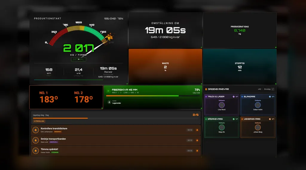
The systems we build now stand on the same component library: more than sixty parts, from buttons and date pickers to data tables and a command palette, built once and reused in Nexus, Formula, and the property platform.
The challenge
The systems we build should wear the customer's brand, and we didn't want to rebuild buttons and tables for every new one.
What we built
A component library where the whole look comes from a theme, with keyboard navigation and reduced motion built in, plus tools to create and switch themes.
How it's used today
Nexus, Formula, and the property platform all run on it, each with a theme of its own.
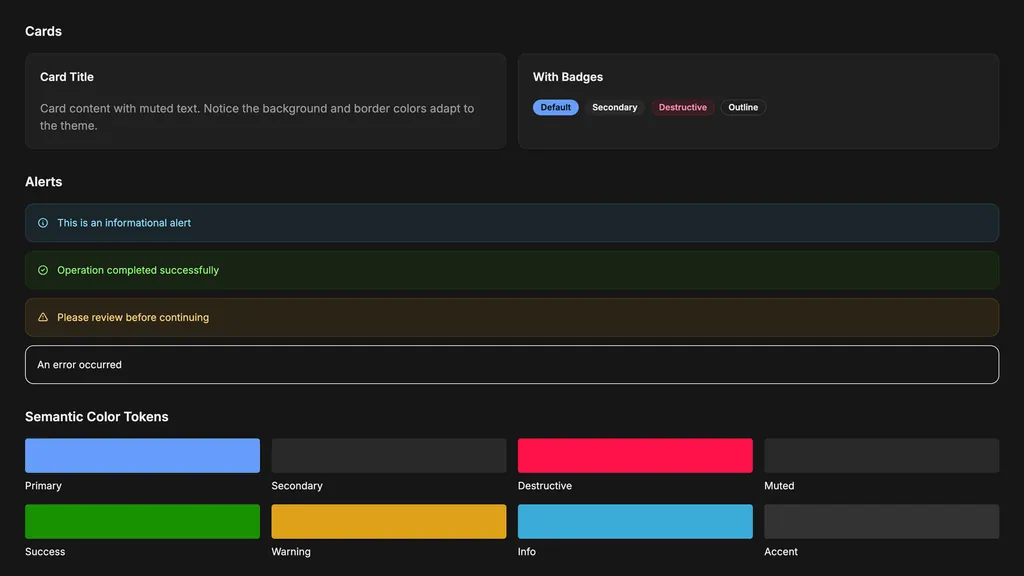
The look lives in a theme, not in the components. Colours, corners, shadows, fonts, and how fast things move all sit in one theme file, with a light and a dark mode. Switch the theme and the same system wears your brand, without a single component being rewritten. The theme file is plain CSS, so it can even be swapped while the app is running.
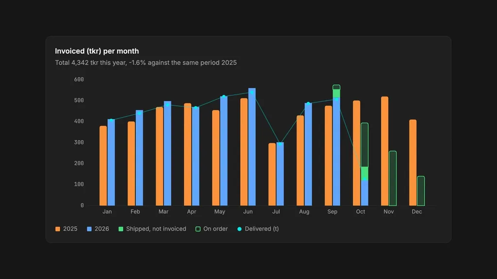
For the people who sit in the system all day, it shows up in other ways. Tables can be sorted, filtered, and searched, charts take their colours from the same theme as everything else, and a single value makes the whole interface denser, with tighter spacing and smaller text, when a dashboard needs to fit more on the screen.
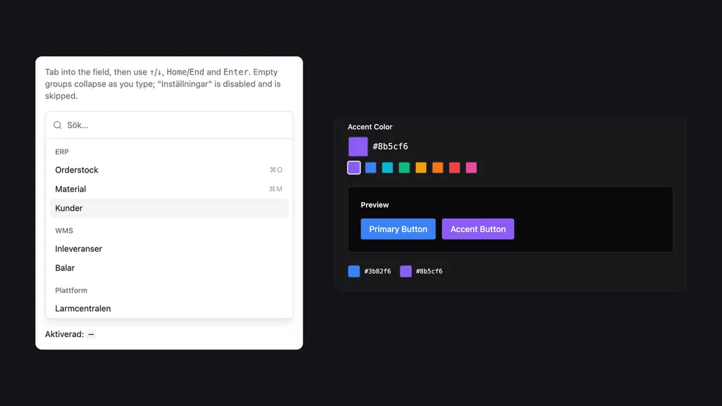
Everything works without a mouse. Every component has keyboard navigation and a visible focus, the command palette runs on the arrow keys, Home, End, and Enter, and screen readers get the right roles and labels. Anyone who has asked their computer for reduced motion doesn't get the animations.
For you, it means a new system doesn't start from scratch. It looks like yours from the first screen, and it works the same way as everything else we build on the library.
Try it
The same components, one theme at a time.
The sample here is real components from the library: a card, buttons, tabs, key figures and a chart. Pick a theme and they change their look, and the table below lists exactly which values changed. No component is rewritten.
Lasts until you close the tab. Only you see it.
The NIT.UI base package in NIT blue. Every app of ours starts here.
Body text contrast: 17.7:1. Muted text: 4.8:1.
This week's deliveries
ActiveThree orders are waiting to be packed. The next truck leaves at two.
Everything that belongs to the project, in one place.
Saved
The change shows at once.What changed 136 values
Source: NIT.UI-norinit-theme packages/themes/nit/tokens.css @ 374831e
| Name | Norin IT | NIT |
|---|---|---|
--accent | #35312c | #f4f4f5 |
--accent-foreground | #ede6db | #18181b |
--background | #0f0d0b | #ffffff |
--border | #75564e | #e4e4e7 |
--card | #282420 | #ffffff |
--card-foreground | #ede6db | #18181b |
--chart-1 | #f97316 | #3b82f6 |
--chart-2 | #86b6dc | #14b8a6 |
--chart-3 | #e8b04a | #f59e0b |
--chart-4 | #7cc48f | #8b5cf6 |
--chart-5 | #c79ab8 | #ec4899 |
--chart-6 | #827b72 | #64748b |
--chart-axis | #c4bbae | #71717a |
--chart-cat-1 | #f97316 | #3b82f6 |
--chart-cat-10 | #7cc48f | #8b5cf6 |
--chart-cat-2 | #86b6dc | #14b8a6 |
--chart-cat-3 | #e8b04a | #f59e0b |
--chart-cat-4 | #7cc48f | #8b5cf6 |
--chart-cat-5 | #c79ab8 | #ec4899 |
--chart-cat-6 | #827b72 | #64748b |
--chart-cat-7 | #f97316 | #3b82f6 |
--chart-cat-8 | #86b6dc | #14b8a6 |
--chart-cat-9 | #e8b04a | #f59e0b |
--chart-current | #f97316 | #3771d1 |
--chart-exempt | #6b655e | #aeaeb4 |
--chart-grid | #75564e | #e4e4e7 |
--chart-negative | #f2735f | #dc2626 |
--chart-other | #d0d0d0 | #373737 |
--chart-positive | #7cc48f | #16a34a |
--chart-previous | #6d6d6d | #8a8a8a |
--chart-projected | #6e391a | #a7c9ff |
--chart-rank-1 | #422516 | #cee1ff |
--chart-rank-2 | #5e3119 | #b5d1ff |
--chart-rank-3 | #7a3e1c | #9ec3ff |
--chart-rank-4 | #994b1d | #85b3fd |
--chart-rank-5 | #b7581d | #6ea3fb |
--chart-rank-6 | #d9661b | #5492f9 |
--chart-rank-7 | #f97316 | #3b82f6 |
--chart-ref-line | #c4bbae | #71717a |
--chart-seq-1 | #422516 | #cee1ff |
--chart-seq-2 | #6c381b | #a9caff |
--chart-seq-3 | #994b1d | #85b3fd |
--chart-seq-4 | #c75e1c | #629cfa |
--chart-seq-5 | #f97316 | #3b82f6 |
--chart-text | #c4bbae | #71717a |
--chart-volume | #86b6dc | #14b8a6 |
--destructive | #f2735f | #dc2626 |
--destructive-foreground | #0f0d0b | #ffffff |
--destructive-soft-foreground | #f2735f | #dc2626 |
--foreground | #ede6db | #18181b |
--info | #86b6dc | #3b82f6 |
--info-foreground | #0f0d0b | #ffffff |
--info-soft-foreground | #86b6dc | #3b82f6 |
--input | #827b72 | #e4e4e7 |
--muted | #191614 | #f4f4f5 |
--muted-foreground | #c4bbae | #71717a |
--muted-foreground-subtle | #c4bbae | #71717a |
--popover | #282420 | #f4f4f5 |
--popover-foreground | #ede6db | #18181b |
--primary | #9a3412 | #1c69e3 |
--primary-foreground | #ede6db | #f8f8f8 |
--primary-soft-foreground | #f97316 | #1c69e3 |
--ring | #f97316 | #1c69e3 |
--secondary | #35312c | #33548c |
--secondary-foreground | #ede6db | #f8f8f8 |
--state-tile-bad-bg | #450a0a | #fef2f2 |
--state-tile-bad-foreground | #fca5a5 | #991b1b |
--state-tile-brand-bg | #1e120e | #edf4fe |
--state-tile-brand-foreground | #f97316 | #1c69e3 |
--state-tile-good-bg | #052e16 | #f0fdf4 |
--state-tile-good-foreground | #86efac | #166534 |
--state-tile-info-bg | #172554 | #eff6ff |
--state-tile-info-foreground | #93c5fd | #1e40af |
--state-tile-neutral-bg | #191614 | #f4f4f5 |
--state-tile-neutral-foreground | #c4bbae | #71717a |
--state-tile-warning-bg | #451a03 | #fffbeb |
--state-tile-warning-foreground | #fcd34d | #92400e |
--state-tint-bad | #f2735f | #dc2626 |
--state-tint-brand | #9a3412 | #1c69e3 |
--state-tint-good | #7cc48f | #16a34a |
--state-tint-info | #86b6dc | #3b82f6 |
--state-tint-neutral | #c4bbae | #71717a |
--state-tint-warning | #e8b04a | #f59e0b |
--success | #7cc48f | #16a34a |
--success-foreground | #0f0d0b | #ffffff |
--success-soft-foreground | #7cc48f | #16a34a |
--warning | #e8b04a | #f59e0b |
--warning-foreground | #0f0d0b | #18181b |
--warning-soft-foreground | #e8b04a | #18181b |
--font-family-display | 'Newsreader Display', 'Newsreader Fallback', 'Georgia', serif | ui-sans-serif, system-ui, sans-serif, 'Apple Color Emoji', 'Segoe UI Emoji' |
--font-family-mono | ui-monospace, 'Cascadia Code', 'Source Code Pro', 'Menlo', 'Consolas', monospace | ui-monospace, 'SFMono-Regular', 'SF Mono', 'Menlo', 'Consolas', monospace |
--font-family-sans | 'Inter', 'Inter Fallback', sans-serif | ui-sans-serif, system-ui, sans-serif, 'Apple Color Emoji', 'Segoe UI Emoji' |
--font-family-special | 'Inter', 'Inter Fallback', sans-serif | ui-sans-serif, system-ui, sans-serif, 'Apple Color Emoji', 'Segoe UI Emoji' |
--radius-alert | 0 | 0.375rem |
--radius-avatar | 0 | 9999px |
--radius-badge | 0 | 9999px |
--radius-btn | 0 | 0.25rem |
--radius-btn-pill | 0 | 9999px |
--radius-card | 0 | 0.375rem |
--radius-checkbox | 0 | 0.125rem |
--radius-chip | 0 | 0.125rem |
--radius-chip-pill | 0 | 9999px |
--radius-input | 0 | 0.25rem |
--radius-lg | 0 | 0.375rem |
--radius-md | 0 | 0.25rem |
--radius-modal | 0 | 0.375rem |
--radius-popover | 0 | 0.375rem |
--radius-progress | 0 | 9999px |
--radius-sm | 0 | 0.125rem |
--radius-switch | 0 | 9999px |
--radius-tooltip | 0 | 0.25rem |
--radius-xl | 0 | 0.5rem |
--radius-2xl | 0 | 1rem |
--duration-fast | 0.2s | 0.1s |
--duration-normal | 0.3s | 0.15s |
--duration-slow | 0.5s | 0.3s |
--gradient-brand | linear-gradient(rgb(154, 52, 18), rgb(154, 52, 18)) | linear-gradient(oklch(0.55 0.2 260), oklch(0.55 0.2 260)) |
--hover-lift | 0 | -2px |
--hover-scale | 1 | 1.02 |
--shadow-2xl | rgba(8, 6, 4, 0.65) 0px 32px 64px -20px | rgba(0, 0, 0, 0.25) 0px 25px 50px -12px |
--shadow-lg | rgba(8, 6, 4, 0.55) 0px 12px 32px -12px | rgba(0, 0, 0, 0.1) 0px 10px 15px -3px |
--shadow-md | none | rgba(0, 0, 0, 0.1) 0px 4px 6px -1px |
--shadow-sm | none | rgba(0, 0, 0, 0.05) 0px 1px 2px 0px |
--shadow-xl | rgba(8, 6, 4, 0.6) 0px 24px 48px -16px | rgba(0, 0, 0, 0.1) 0px 20px 25px -5px |
--norinit-brand-ink | #f97316 | #1c69e3 |
--norinit-brand-hover | #b0400f | #1c69e3 |
--norinit-brand-faint | #9a341226 | #1c69e326 |
--norinit-brand-soft | #9a341266 | #1c69e366 |
--norinit-brand-strong | #9a3412a6 | #1c69e3a6 |
--norinit-surface-low | #35312c | #f4f4f5 |
--norinit-outline | #aa8984 | #e4e4e7 |
--norinit-outline-dim | #75564e | #e4e4e7 |
--norinit-credit-color | #f973168c | #1c69e38c |
--norinit-logo-shape | #6e6e6e | #71717a |
--norinit-logo-shape-hover | #8a8a8a | #45454b |
--norinit-logo-dot | #4d4c4c | #b8b8bd |
The values come from the real theme files. Norin IT, NIT and Nexus are our own; CE Formula, Polarstigen, GnosjöBo and Gislatorp belong to clients and are shown with their permission.
How we built it
The components know nothing about colours or fonts. They read all of that from the theme, which is why the same button can look like Nexus in one system and like your brand in the next.
One theme drives the look
Colours, corners, shadows, fonts, and motion are tokens in one theme file, with light and dark modes. The components only ever point at the tokens, so a new brand is a new theme file and nothing else.
Themes switch at runtime
The theme file is plain CSS that can be loaded while the app is running, with nothing to rebuild.
Local themes
Part of a page can get its own colours, for example a module in a colour of its own.
Denser when it needs to be
One value scales spacing and text size across the whole interface, or just one part of it. Corners, shadows, and lines stay as they are.
Keyboard first
Keyboard navigation, visible focus, and the right ARIA roles in every component, built to WCAG 2.1 AA. Animations switch off for anyone who has asked for reduced motion.
Tables built for work
Sorting, filtering, search, and paging in the data table, and long lists that stay smooth.
Charts that follow the theme
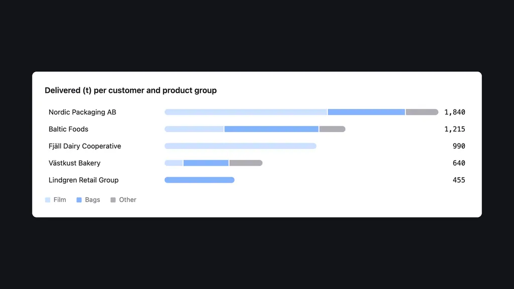
Time series, stacked bars, heatmaps, treemaps, and sparklines take their colours from the same tokens as everything else.
The theme tool
It reads the theme files, generates typed colours for the code, and works out whether text on each colour should be black or white to meet the contrast requirements.
- SvelteKit
- TypeScript
- Tailwind CSS
Gallery
Key metrics
- Components in the library
- 60+
- From buttons and date pickers to data tables, a command palette, and a number pad for PIN codes.
- Theme file per look
- 1
- Colours, corners, shadows, fonts, and motion, in a light and a dark mode.
- Components rewritten for a new brand
- 0
- A new brand gets a new theme. The components stay exactly as they are.
Got a system everyone's waiting on?
Tell us what you want to build and we'll take it from there.
Next project
Manufacturing · Real-time systems